Refining the Details, Refreshing the Story
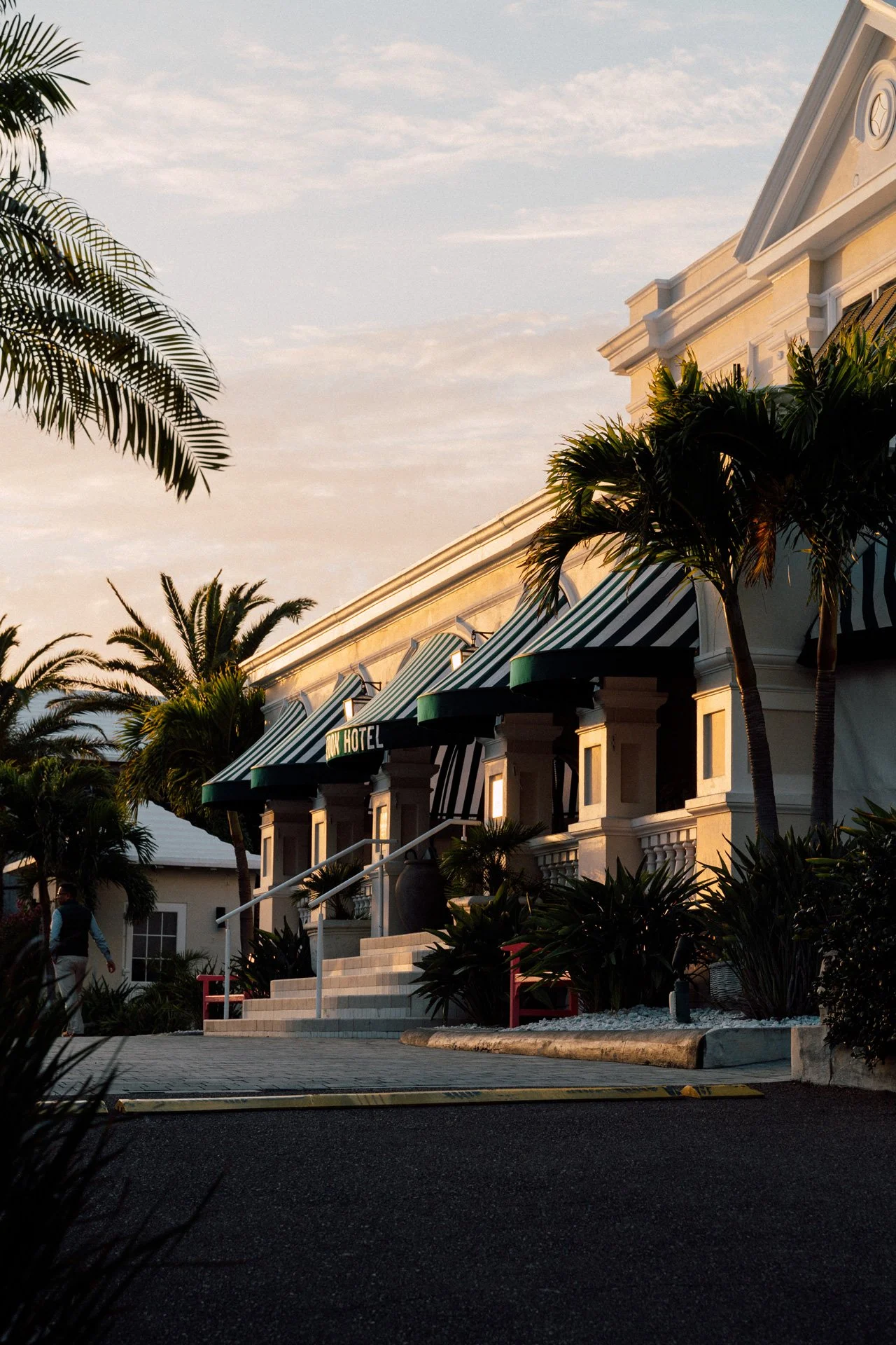
Guest partnered with Boutique Hotel Rosedon to evolve the brand for a new era, refreshing its visual identity and refining every guest touchpoint to align with the hotel’s mid-century aesthetic and laid-back sophistication.

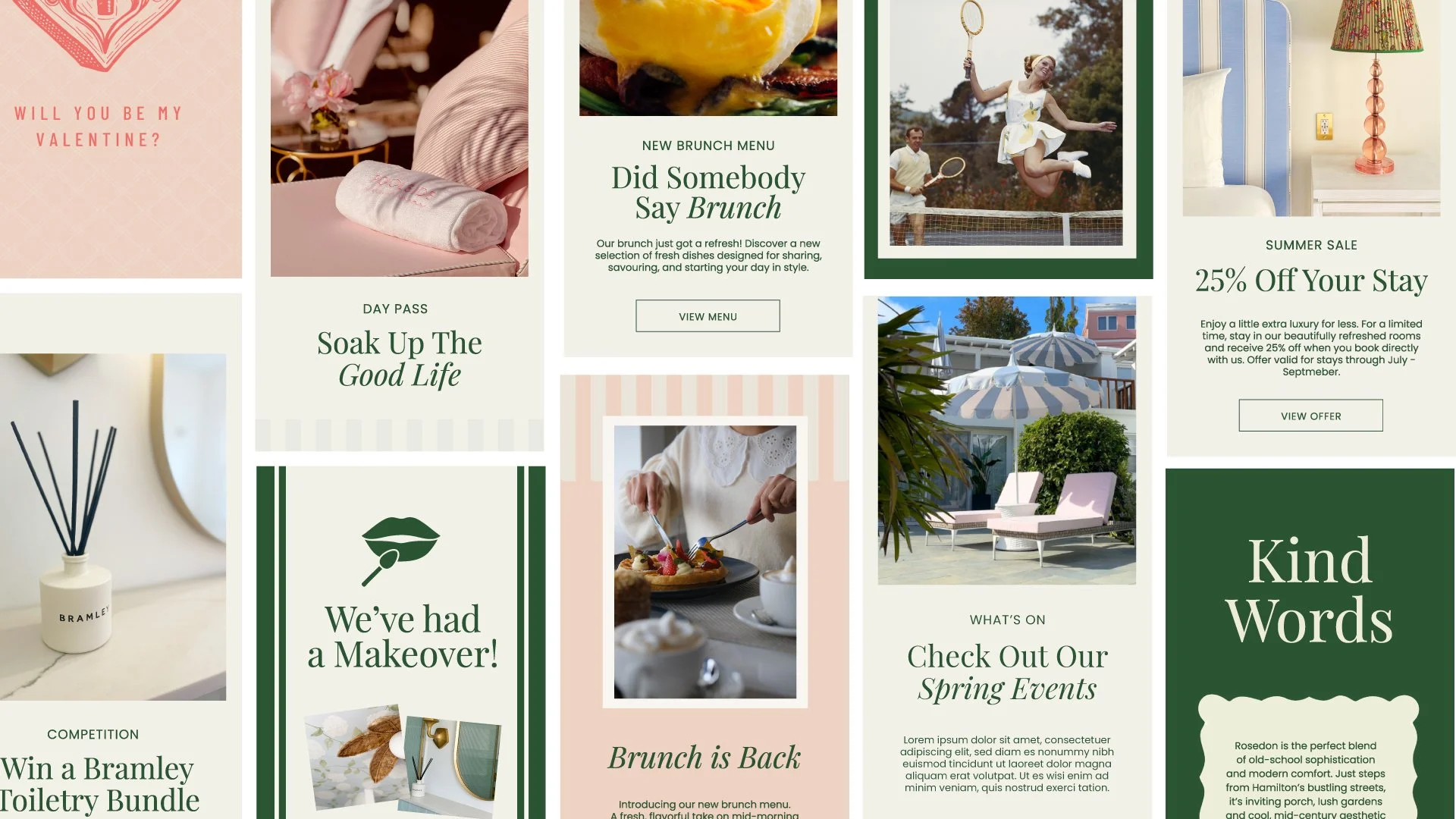
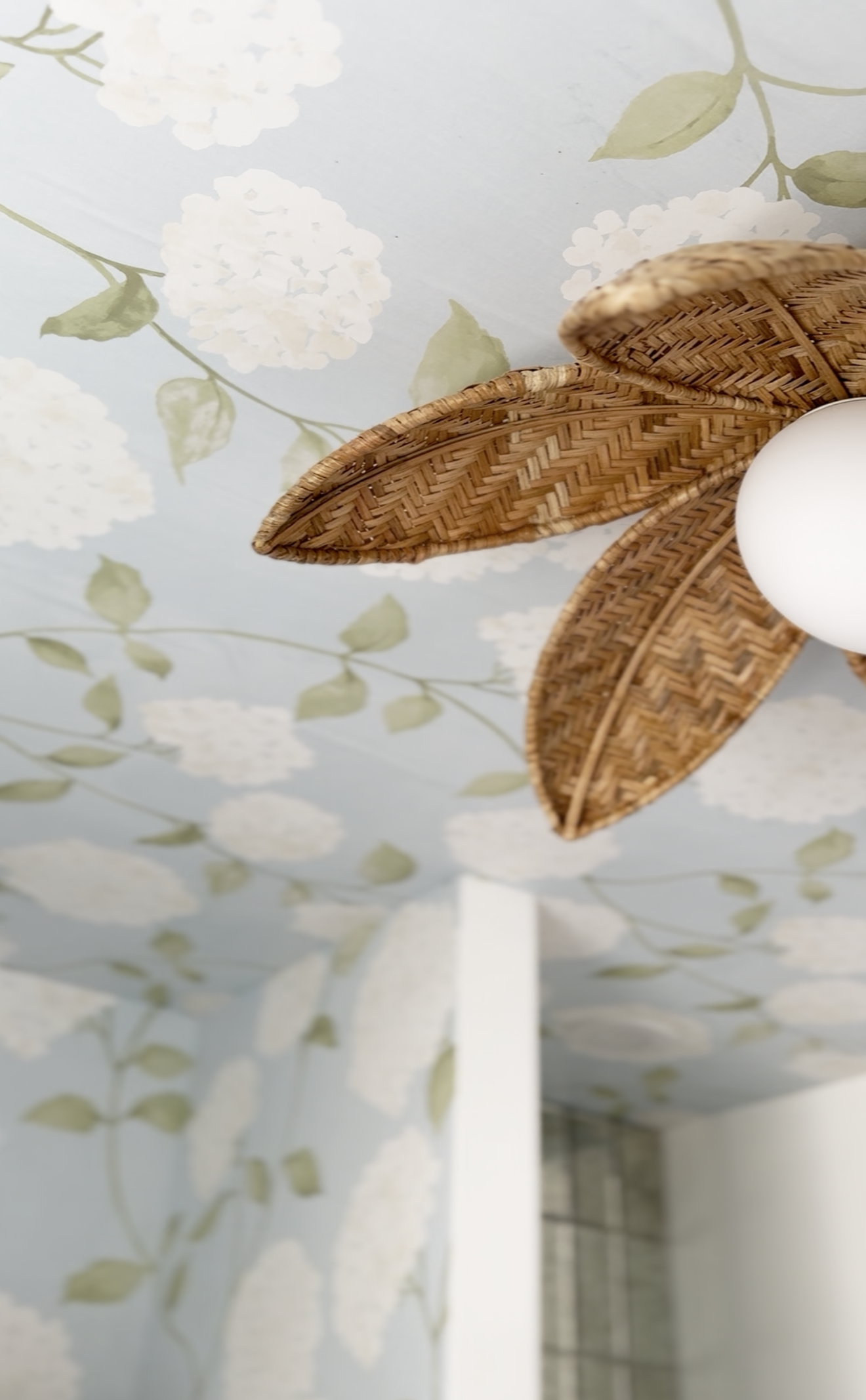
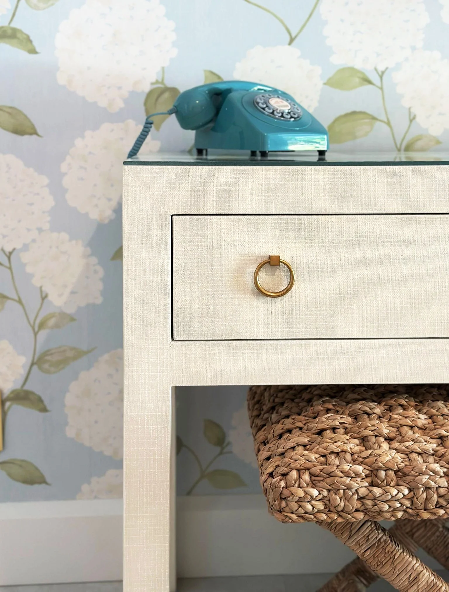
We began the rebrand by refining the hotel’s colour palette , a subtle but powerful shift.
By toning down some of the brighter hues and introducing deeper, more muted tones, we created a palette that feels both more cohesive and more aligned with the timeless elegance of mid-century design. The updated colours bring a sense of refinement and warmth, helping every touchpoint, from signage to stationery, feel part of the same considered visual world.

We’ve been fortunate to work with the dedicated team at Guest, who played a pivotal role throughout the process. They brought a calm, strategic approach and a sharp creative eye, helping us shape a brand direction that feels elevated, authentic, and true to who we are.
— Matthew Kitson, General Manager
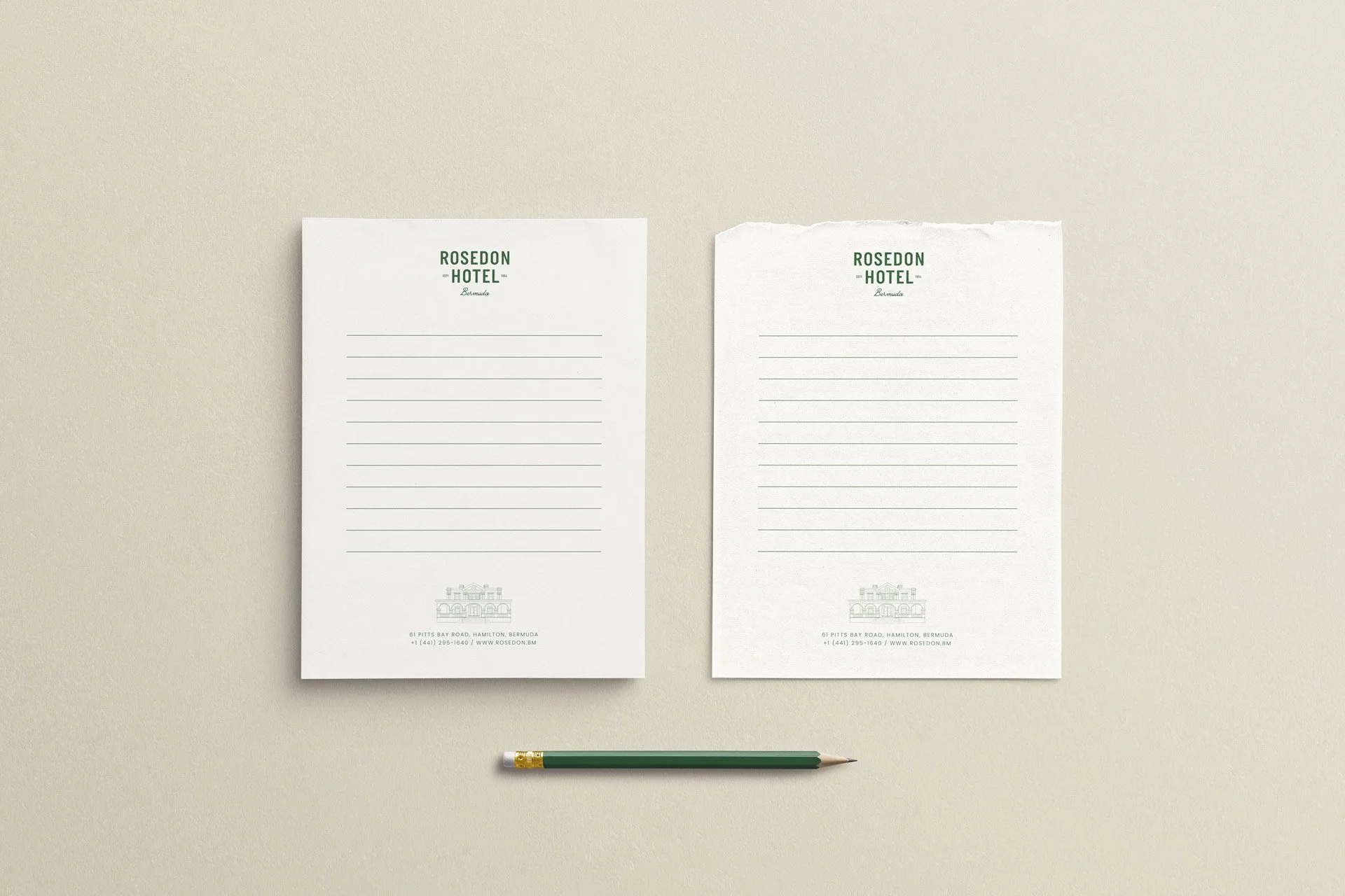
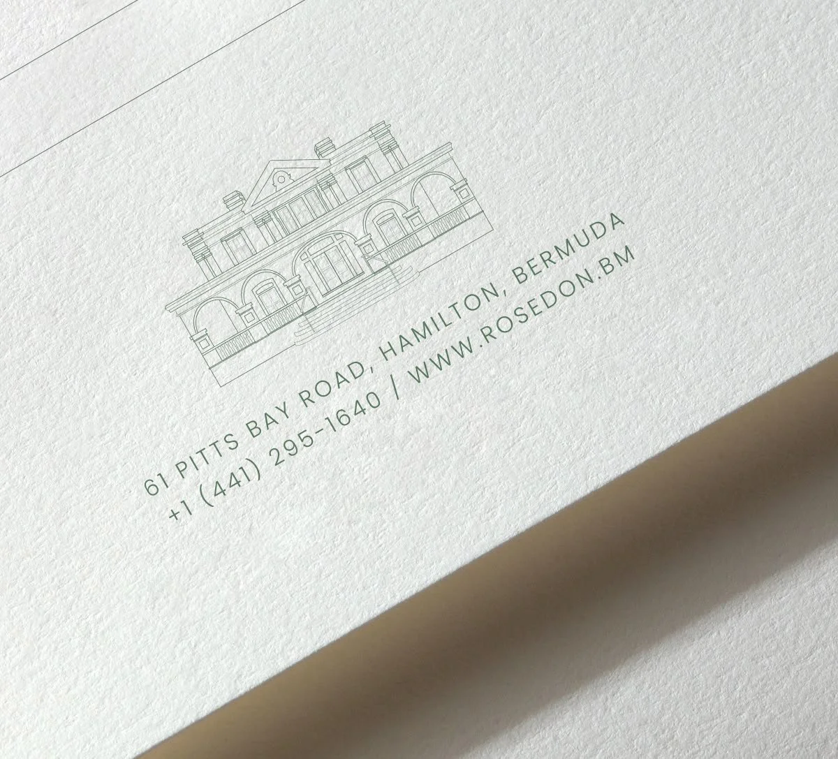
The notepads and stationary borrow quietly from the language of school desks, post offices, and old-fashioned homework - ruled lines, practical formats, and a soft nostalgia for the analogue.
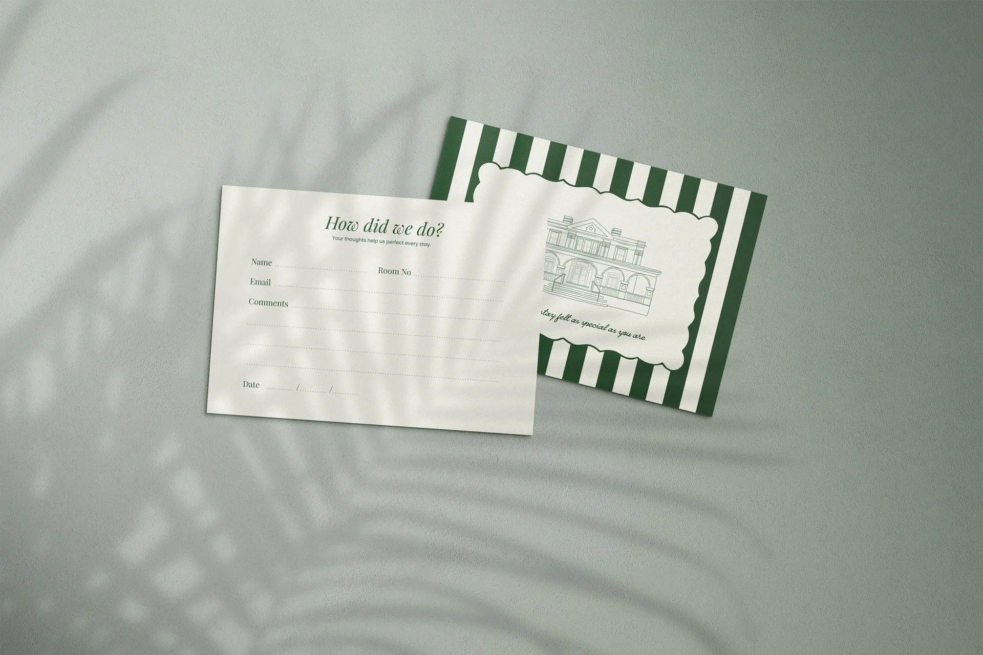
Simple, tactile, and inviting — these feedback postcards encourage guests to share their thoughts in their own words, not by ticking boxes. A gentle nudge toward real conversation, handwritten notes, and reflections worth reading.

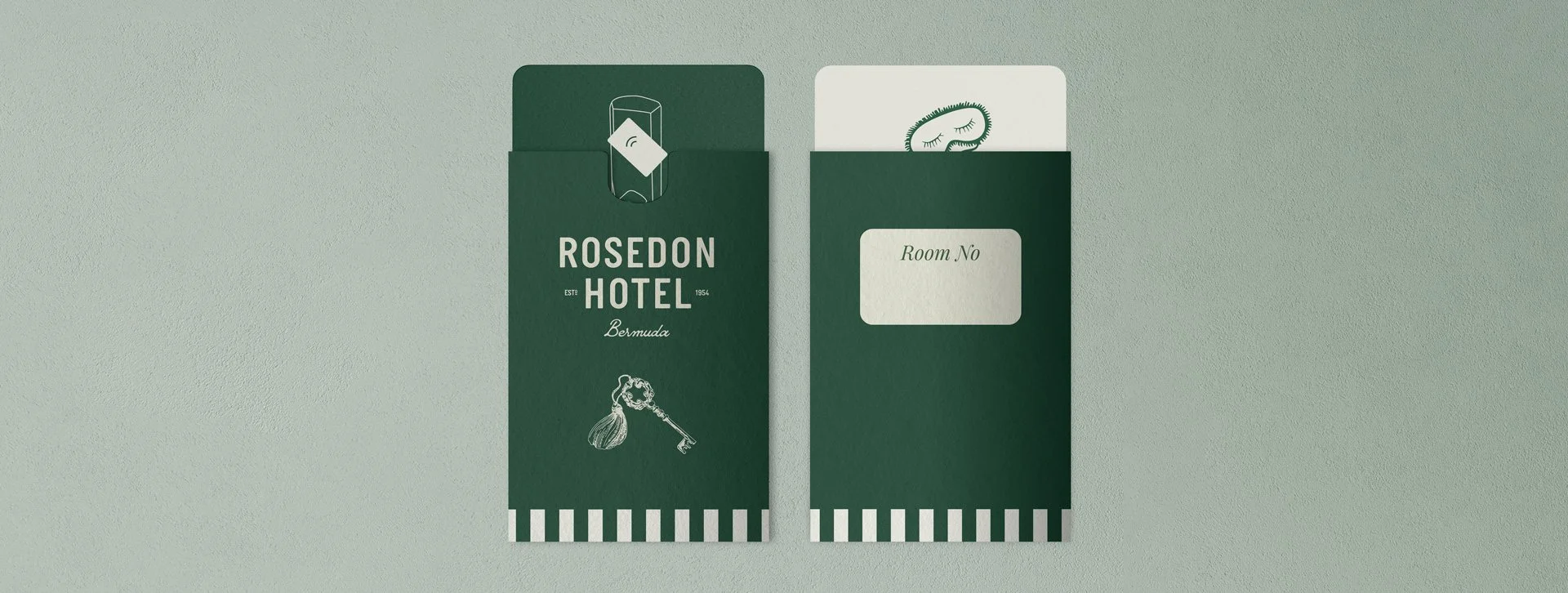
We designed key cards that extend the brand’s visual language to even the smallest details with playful messaging and hand drawn illustrations - the key with large tassel is a nod to the mid-century hotel keys once hanging behind the front desk.
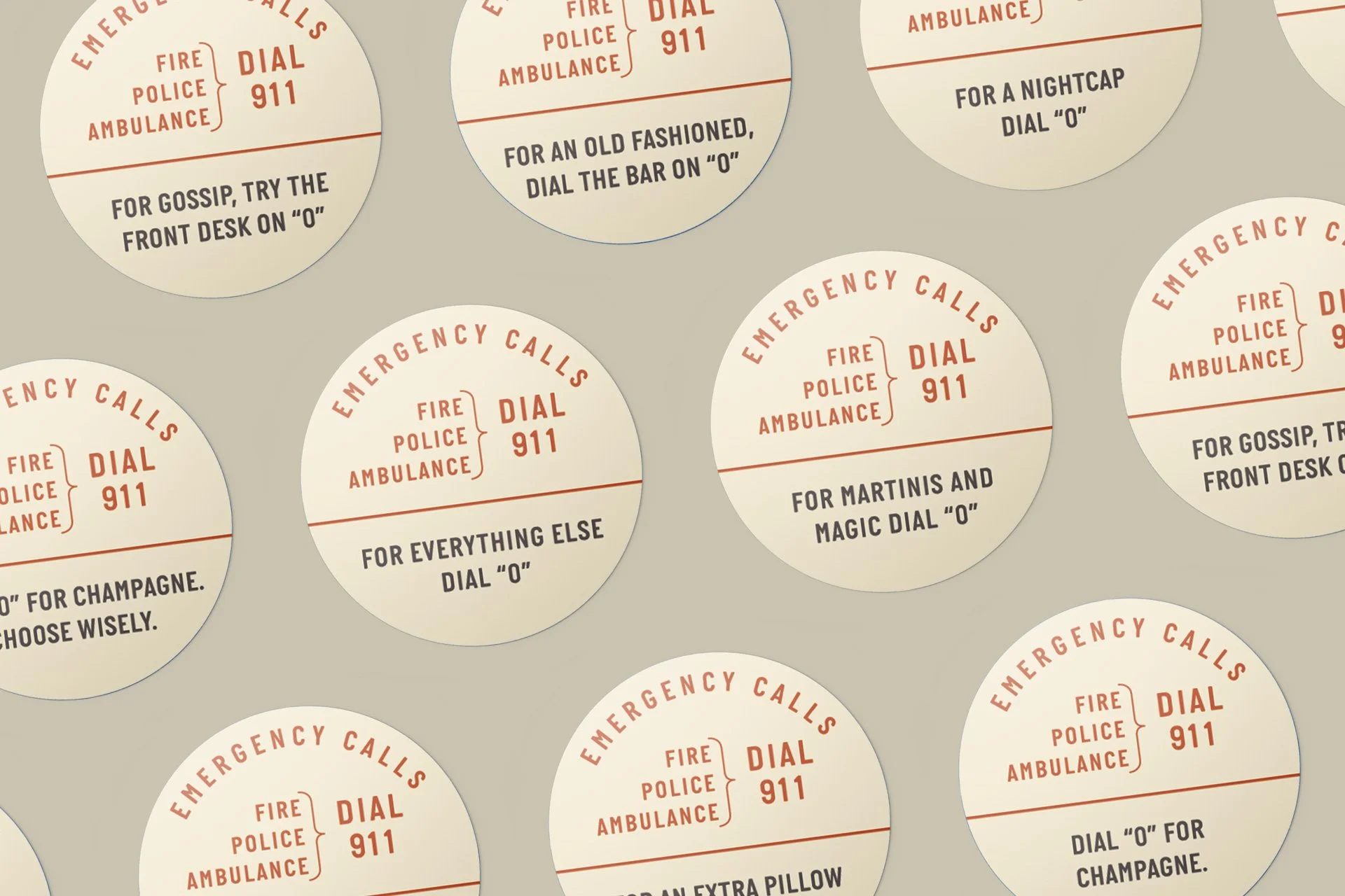
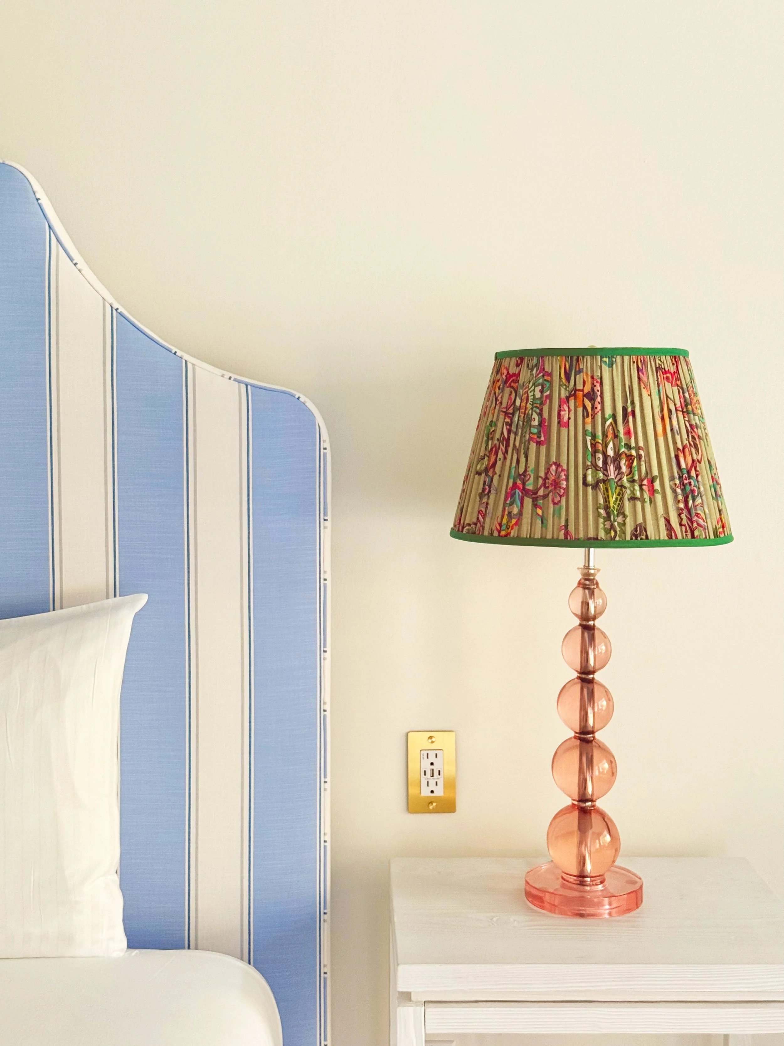
To help achieve the mid-century look and feel, each room features a colourful retro-style Bakelite phone. We designed custom dial cards to sit at the centre — playful, charming, and carefully styled. Borrowing from the nostalgic language of old-school telephones, they turn a functional object into a moment of delight.

This was more than a design project. It was about reinforcing the Rosedon brand with every interaction—subtly, beautifully, and with purpose. Every item feels like it belongs in the room because it belongs to the Rosedon story.
More projects
-
![]()
Bagels & Brews | Brand Creation
-
![]()
Poolside Bar | Brand Development
-
![]()
Clarabell's Restaurant | Collateral Design
-
![Hotel Marketing Agency]()
Hotel | Email Marketing