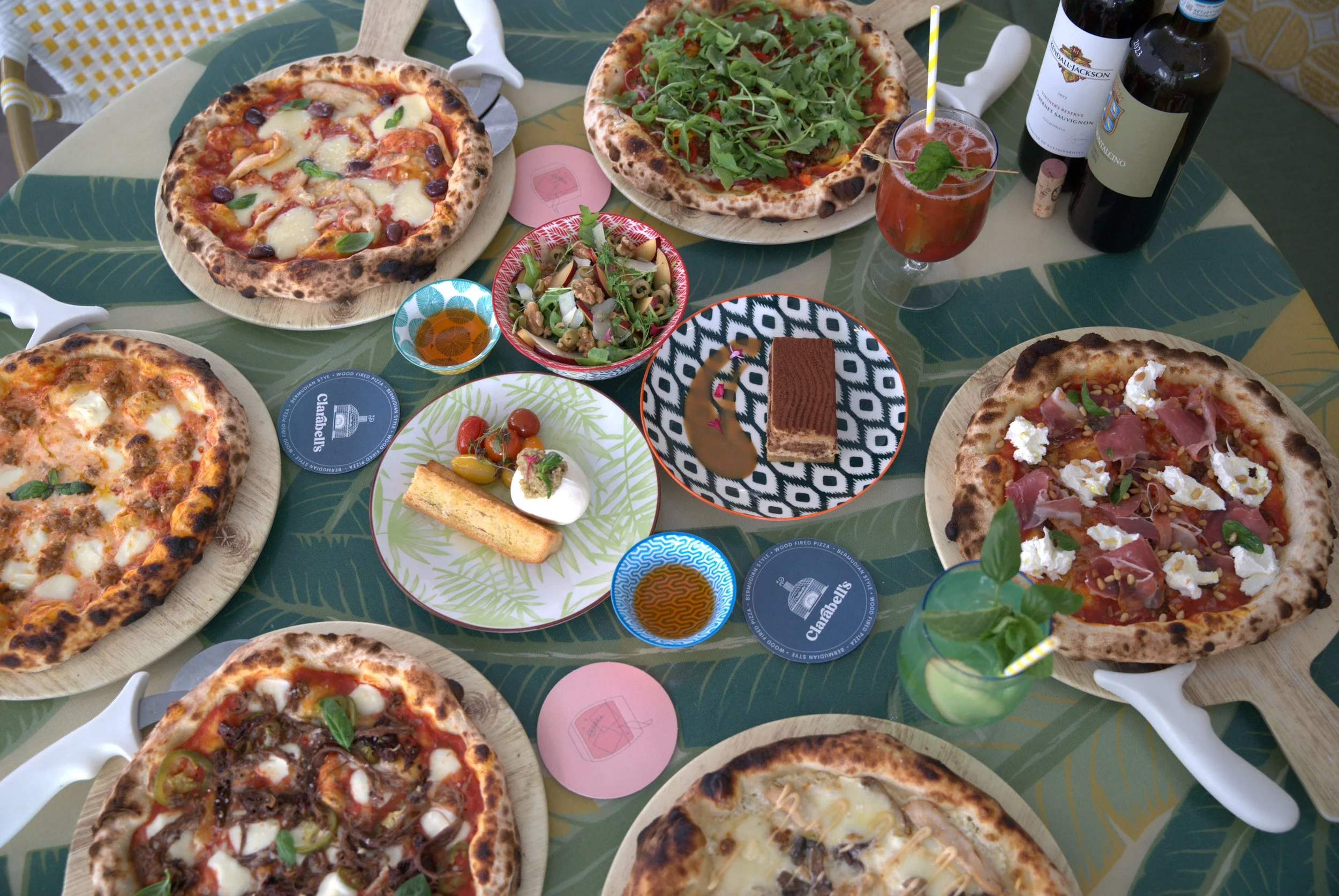

Turning a New Dining Concept into a Destination
Nestled in the tropical grounds of the Rosedon Hotel, Clarabell’s is a testament to heritage and hospitality. Following the hotel’s transition to a refined mid-century style, we were commissioned to build a brand identity for this new garden-side pizzeria. The result is a brand that feels both nostalgic and fresh.
A Legacy Rekindled
“Inspired by the woman
who made every guest
feel like family.”
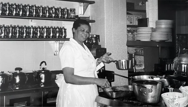
Our design journey began with a deep dive into the soul of the Rosedon Hotel. Clarabell wasn’t just a chef, she was the heartbeat of the hotel’s kitchen for over three decades.
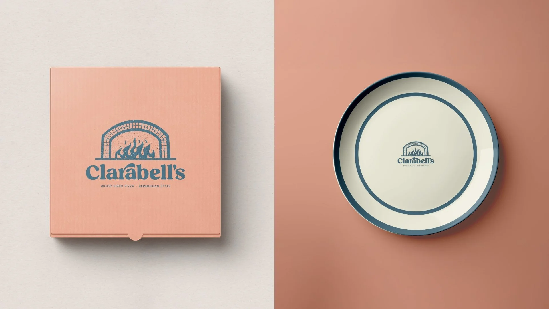
To honour her, the brand identity isn’t just pizza-focused, it’s hospitality-focused. We moved beyond the typical red-and-white checkered tropes of pizzerias to find a visual language that mirrors Clarabell’s legendary warmth.

A Visual Handshake:
The Identity
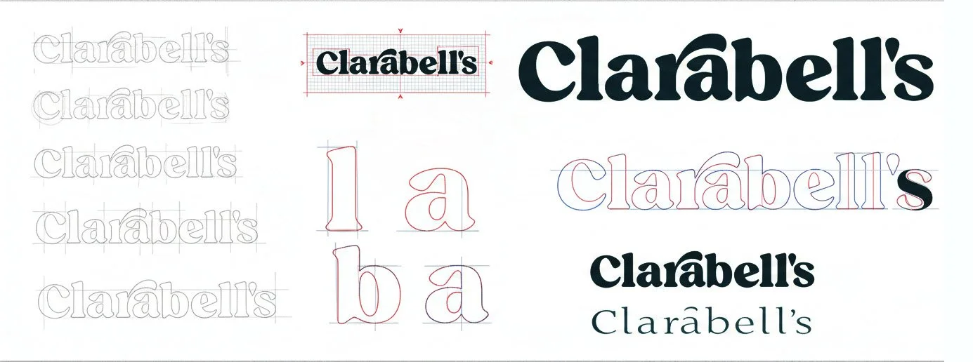
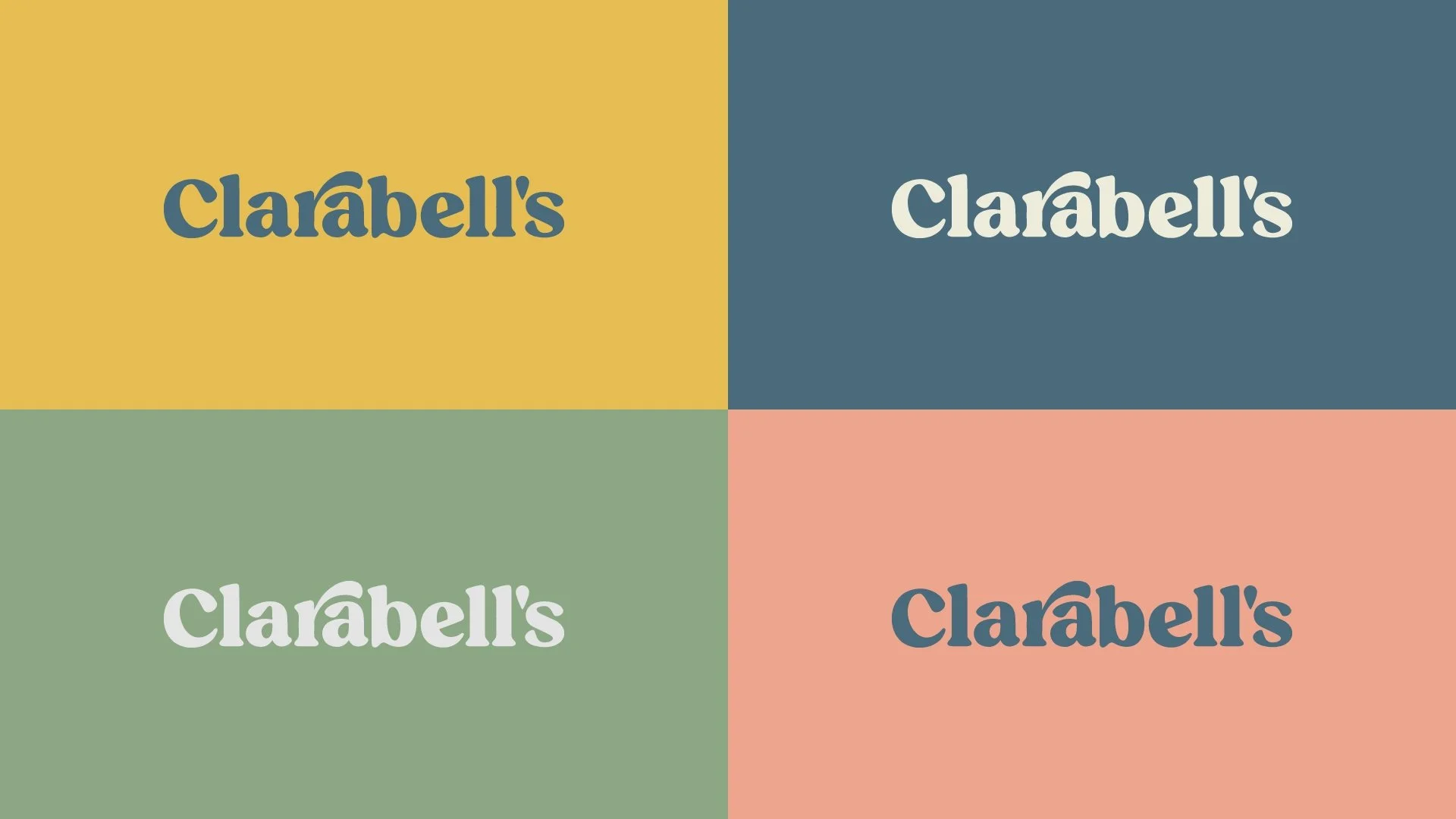
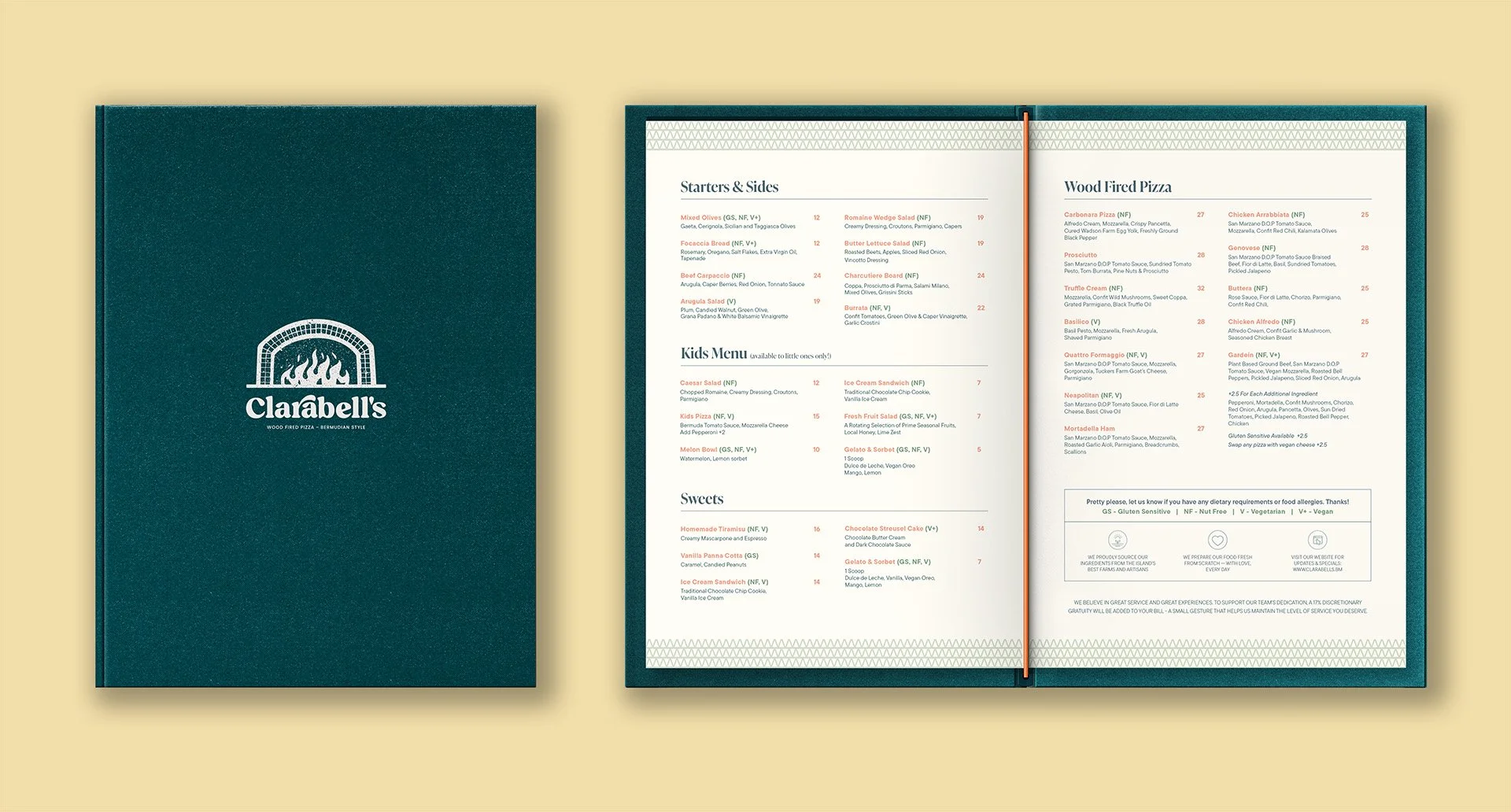
The Clarabell’s logo was crafted to feel like an invitation. We prioritised soft, rounded forms and approachable typography to mirror Clarabell’s renowned kindness.
We opted for a Human-Centric feel, avoiding corporate rigidity, in favour for a hand-finished feel that suggests the care and attention to detail found in her cooking.

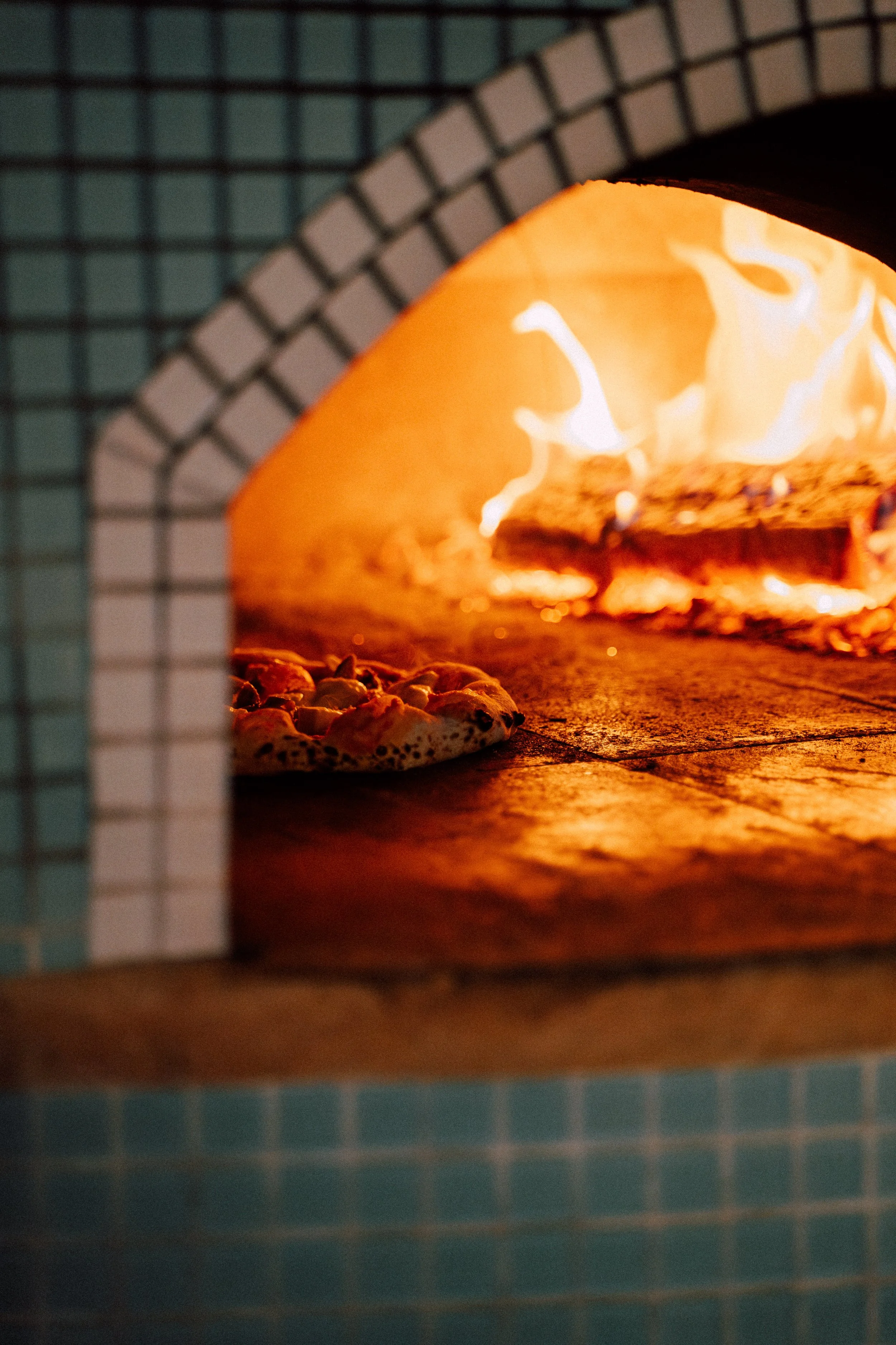
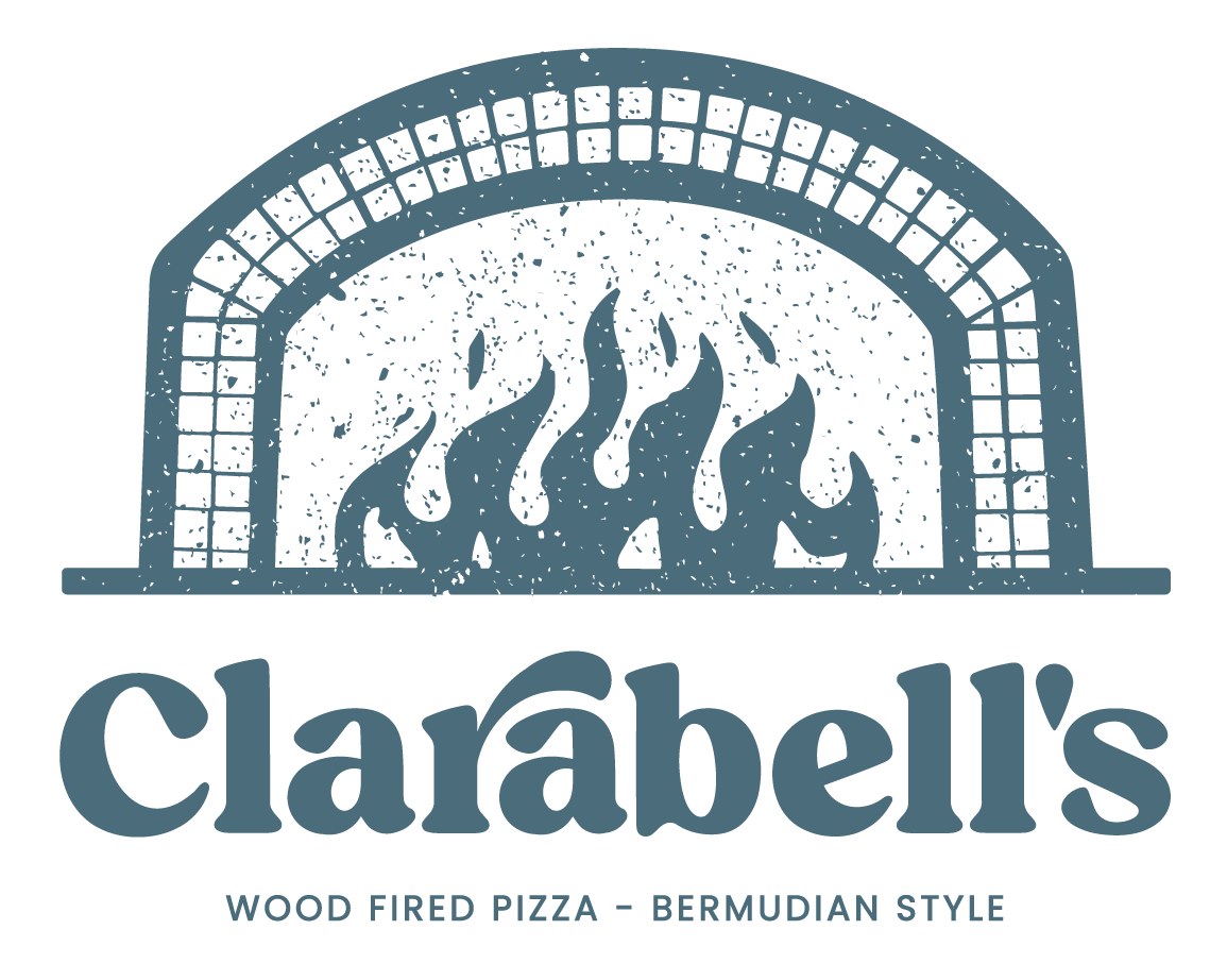
Central to the brand’s visual shorthand is a graphic element inspired by the mouth of the hand-built wood-fired oven. This archway isn’t just a tool, it represents the ‘hearth’ of the restaurant. The literal and metaphorical opening where fire meets flavour and a symbol that bridges traditional craft with modern identity.
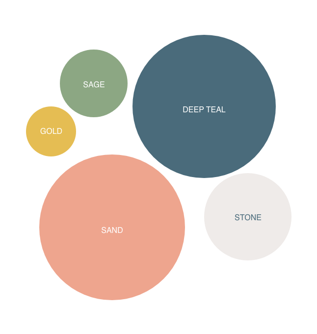
The colour story was carefully curated to bridge the gap between Clarabell’s persona and the physical environment of Rosedon’s tropical grounds.
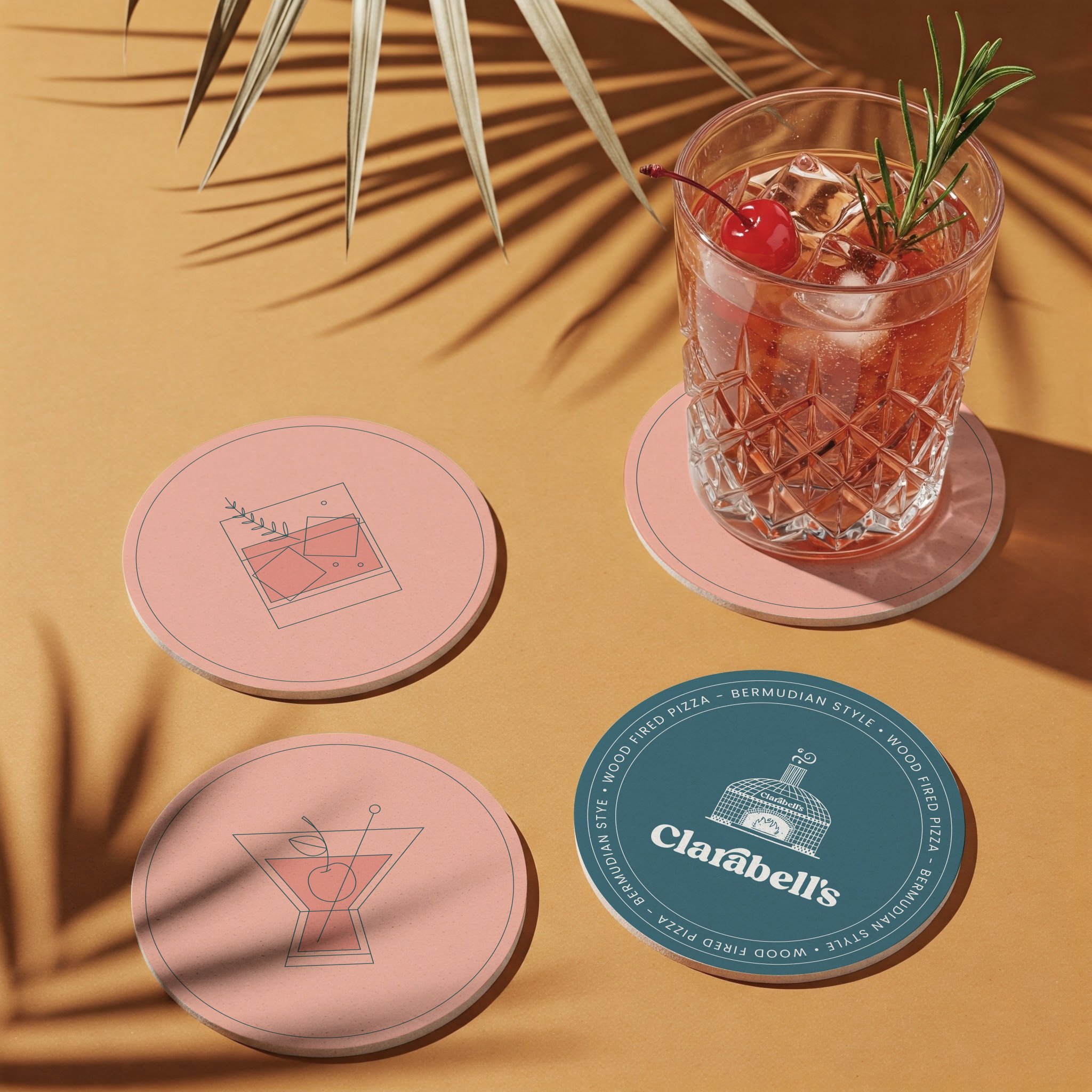
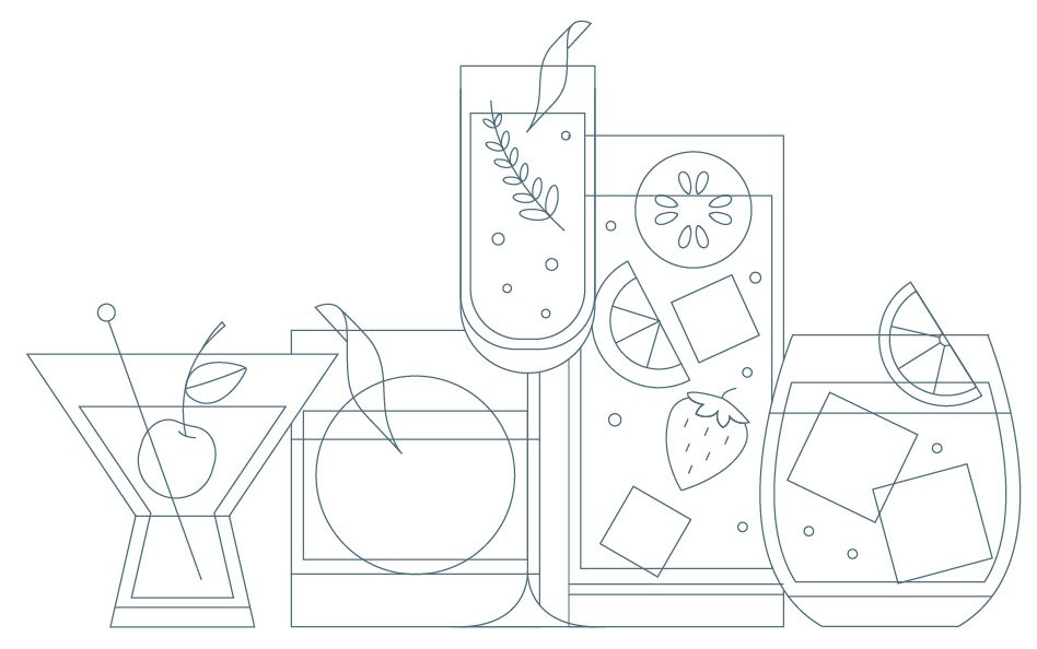
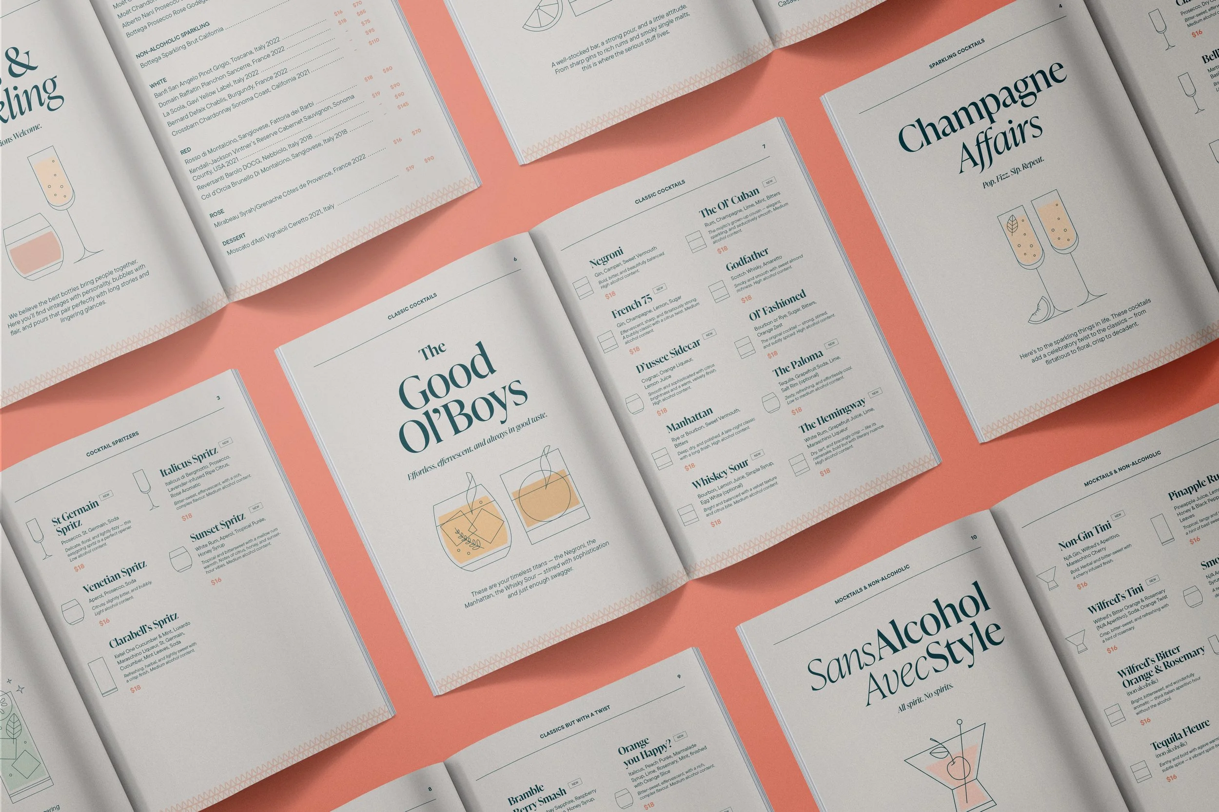
We developed a bespoke set of hand-drawn illustrations exclusively for the cocktail menu. These illustrations lean into the "hand-built" ethos of the restaurant, to provide a whimsical, artisanal look that feels as unique as a hand-poured drink in a secret garden.
More projects
-
![]()
Bagels & Brews | Brand Creation
-
![]()
Poolside Bar | Brand Development
-
![]()
Hotel | Email Marketing
-
![]()
Paid Social Media Marketing


