Transforming a Bermuda Classic into a Modern Boutique Destination
From a change to the brand position with a fresh new identity through to all the
little details that make a truly remarkable boutique hotel with soul.
The Challenge
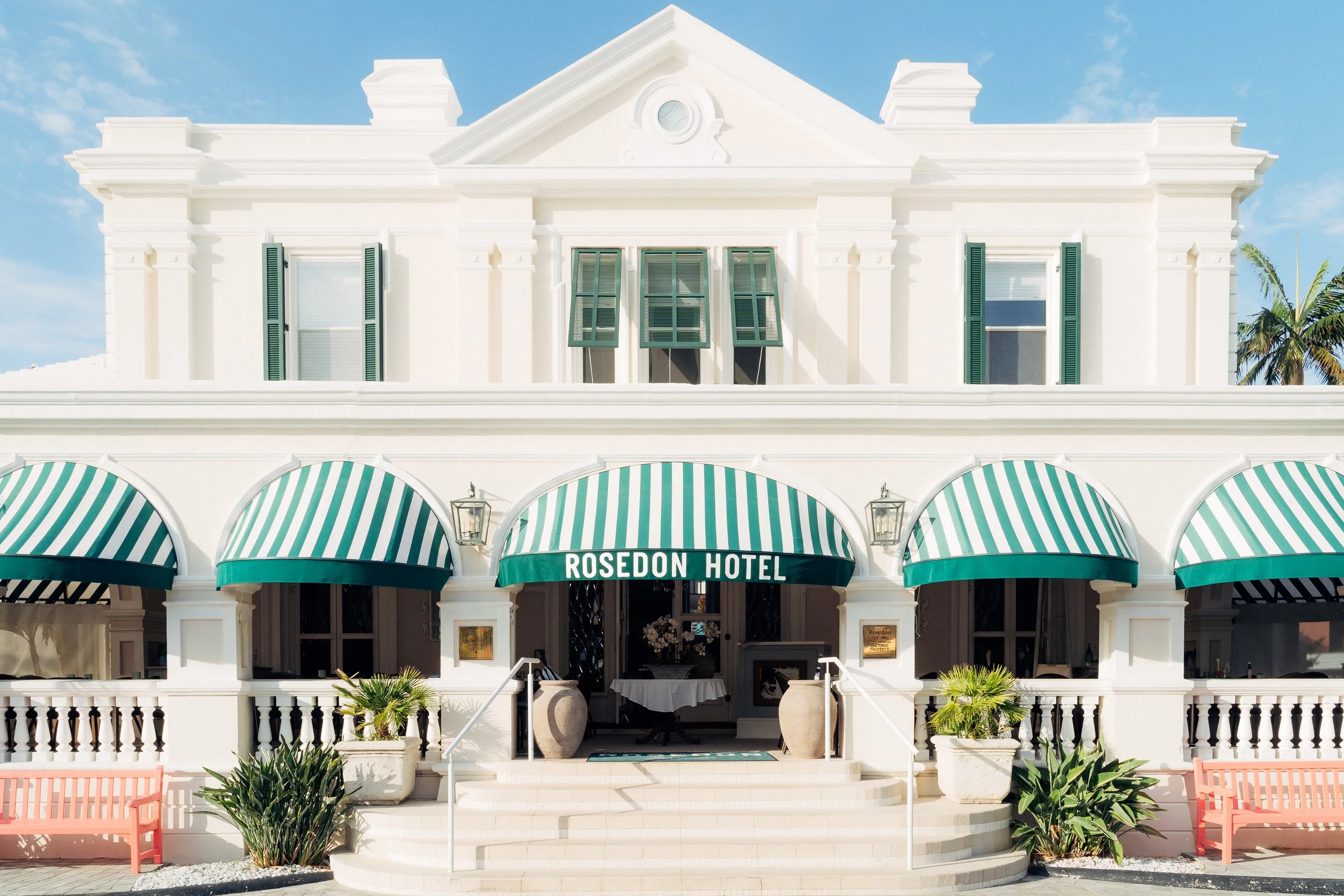
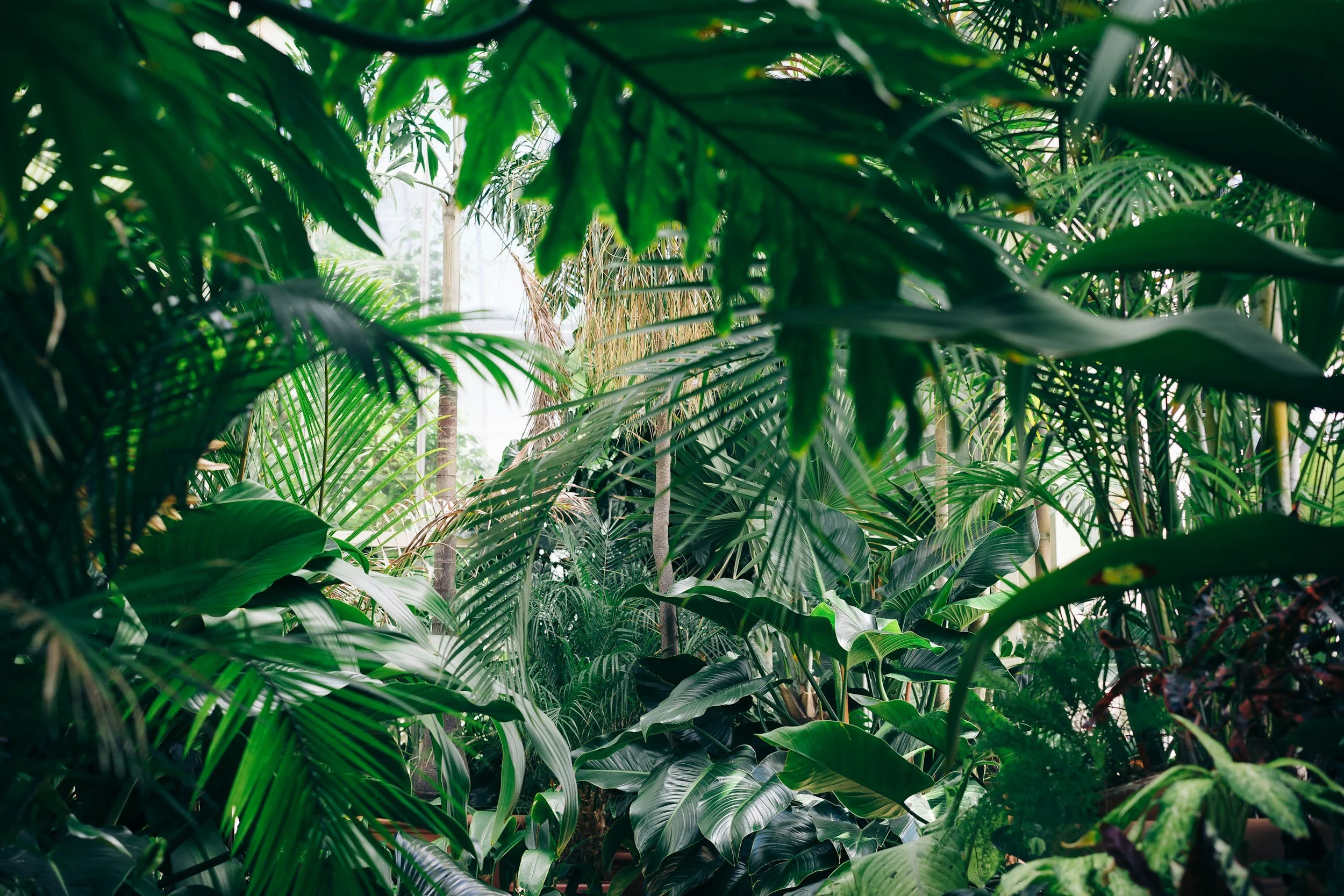
Rosedon was a much-loved 20-room Bermuda hotel with the feel of a traditional B&B and a single fine-dining restaurant. While full of charm, the property had begun to feel dated and under-realised.
A newly appointed General Manager set out to reposition Rosedon as a design-led, Soho House–style boutique hotel - one that would appeal to a style-conscious leisure audience across the US and Europe, elevate perception, and support increased room rates.
We were appointed as creative and strategic partner to help bring that vision to life.

Our Approach
We didn’t just send PDFs from afar. Our team worked on-property several times a year, becoming an extension of the Rosedon family. We bridged the gap between high-level strategy and granular execution.
We began by uncovering the essence of Rosedon, its sense of place, generous grounds, and relaxed sophistication and reinterpreting it for a contemporary audience.
Through stakeholder workshops, we defined a new positioning and brand platform designed to:
Attract a style-conscious leisure demographic across the US and Europe
Elevate the guest experience and commercial performance
Expand food and beverage offerings to fully utilise the property
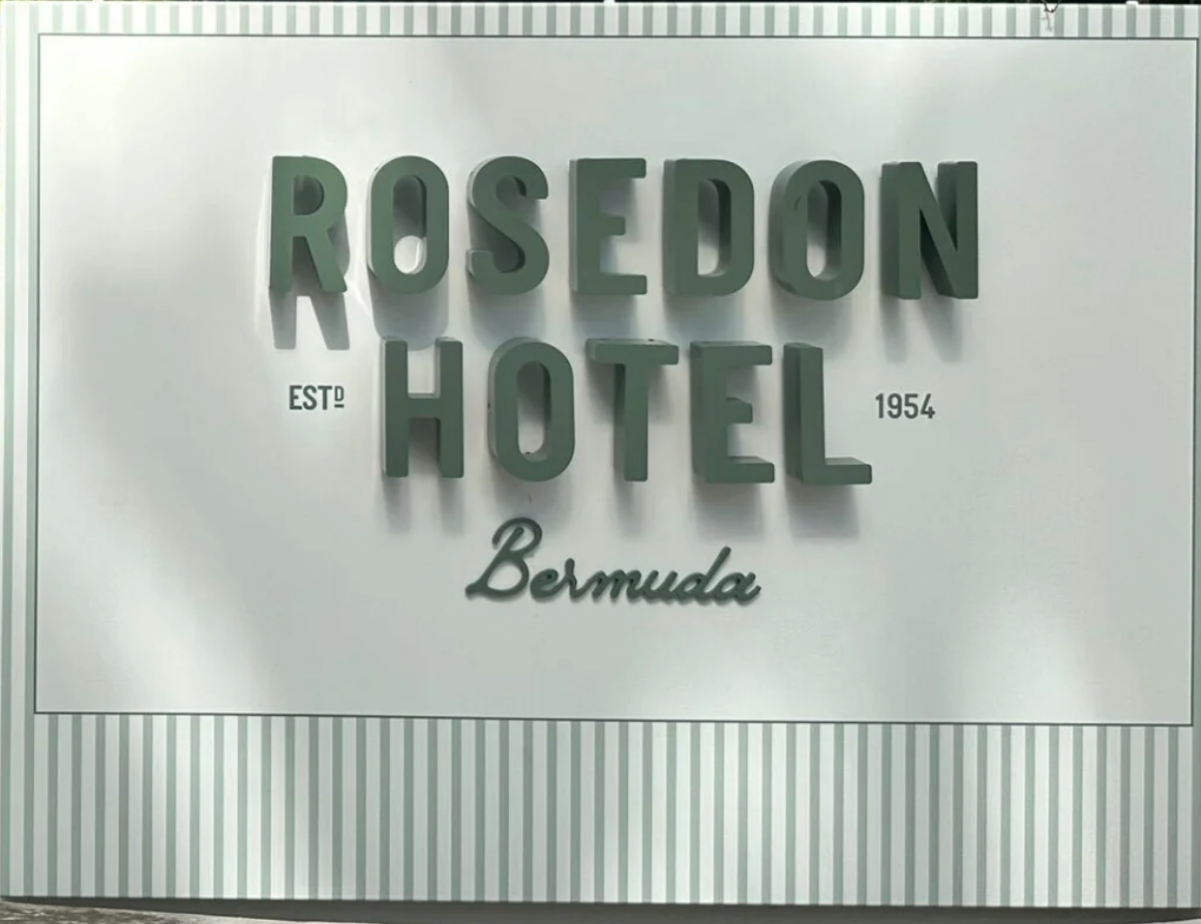
We began the rebrand by refining the hotel’s colour palette — a subtle but powerful shift.
By toning down some of the brighter hues and introducing deeper, more muted tones, we created a palette that feels both more cohesive and more aligned with the timeless elegance of mid-century design. The updated colours bring a sense of refinement and warmth, helping every touchpoint, from signage to stationery, feel part of the same considered visual world.

The Brand Transformation
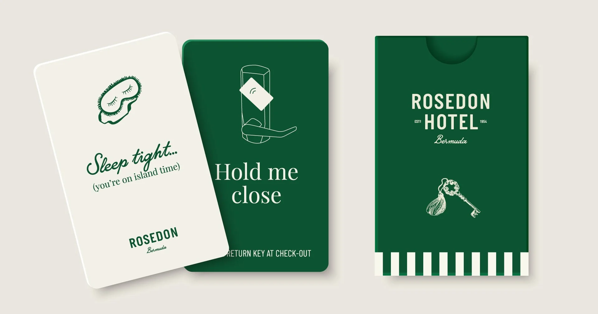
We created the Rosedon brand from the ground up and rolled it out across every touchpoint, including:
Website design & development
Photography & video art direction
Property signage design
Stationery & in-room collateral
All digital assets

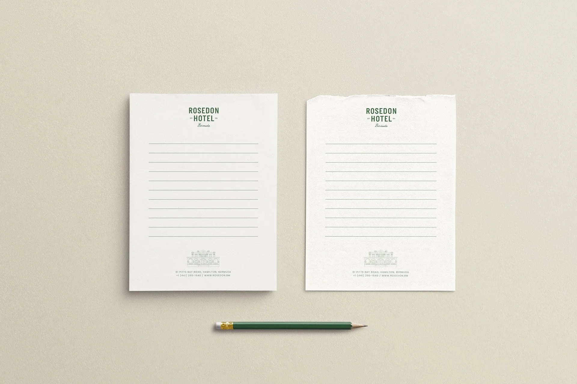
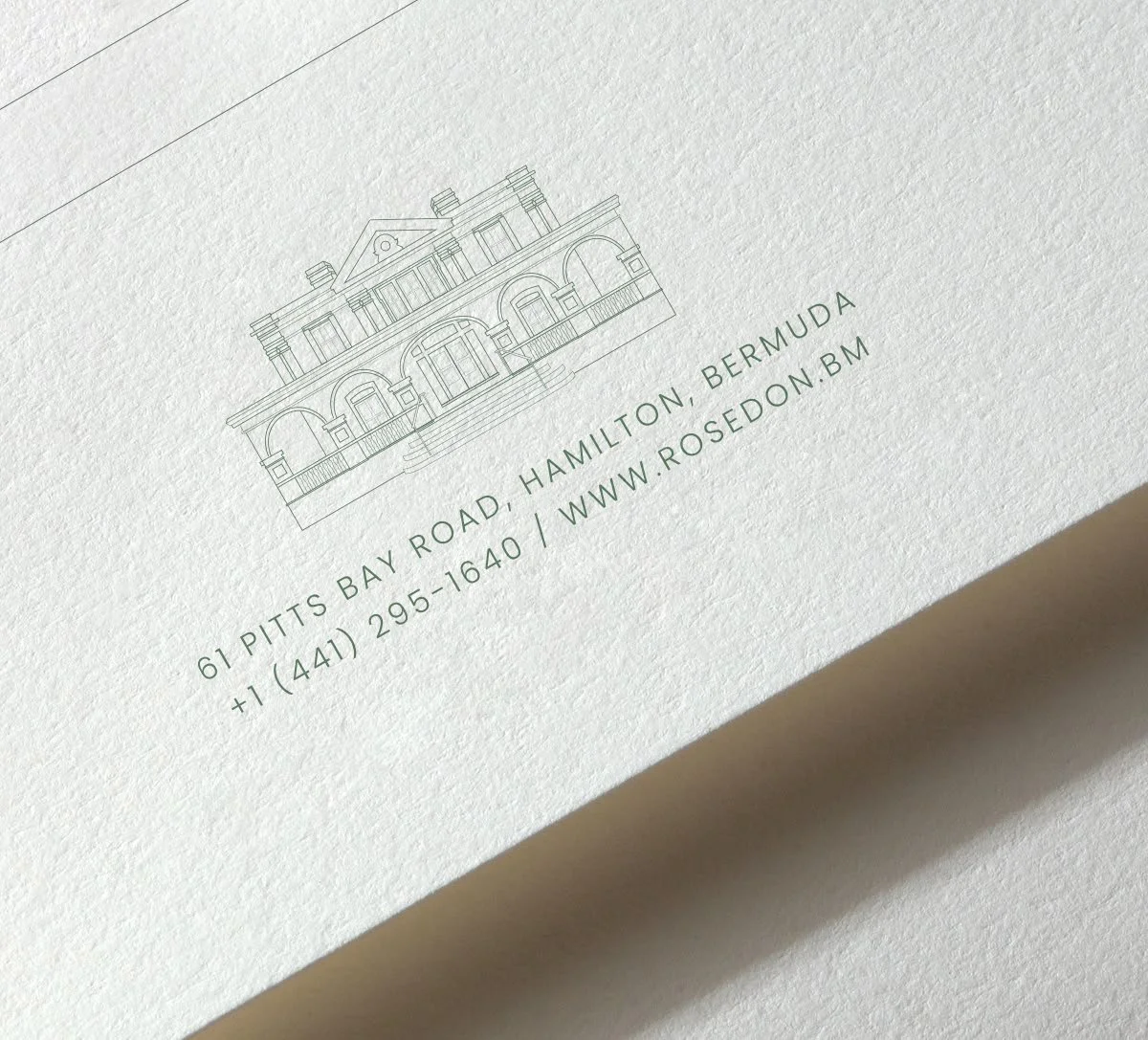
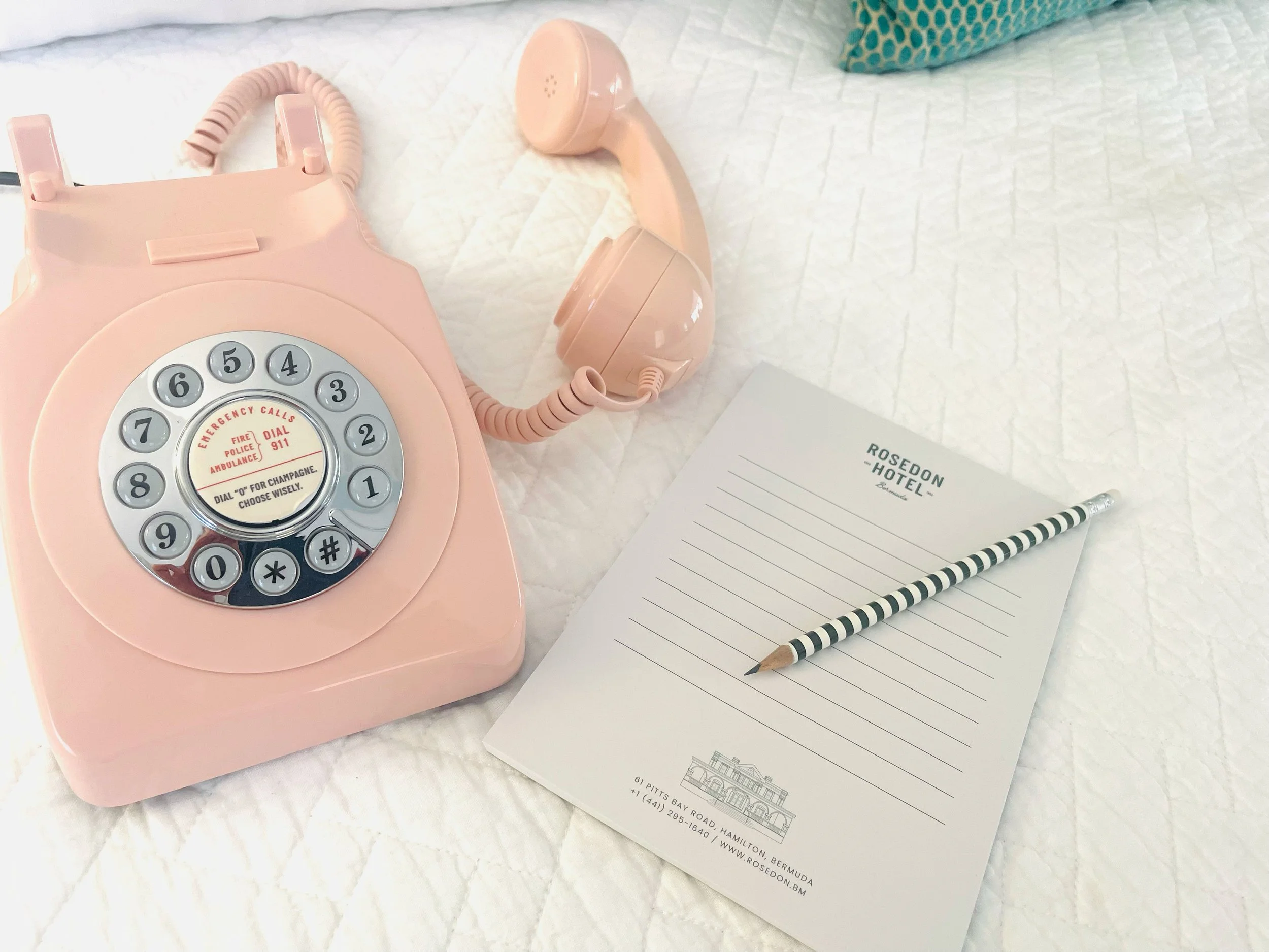
The notepads and stationary borrow quietly from the language of school desks, post offices, and old-fashioned homework - ruled lines, practical formats, and a soft nostalgia for the analogue.
Expanding the Experience
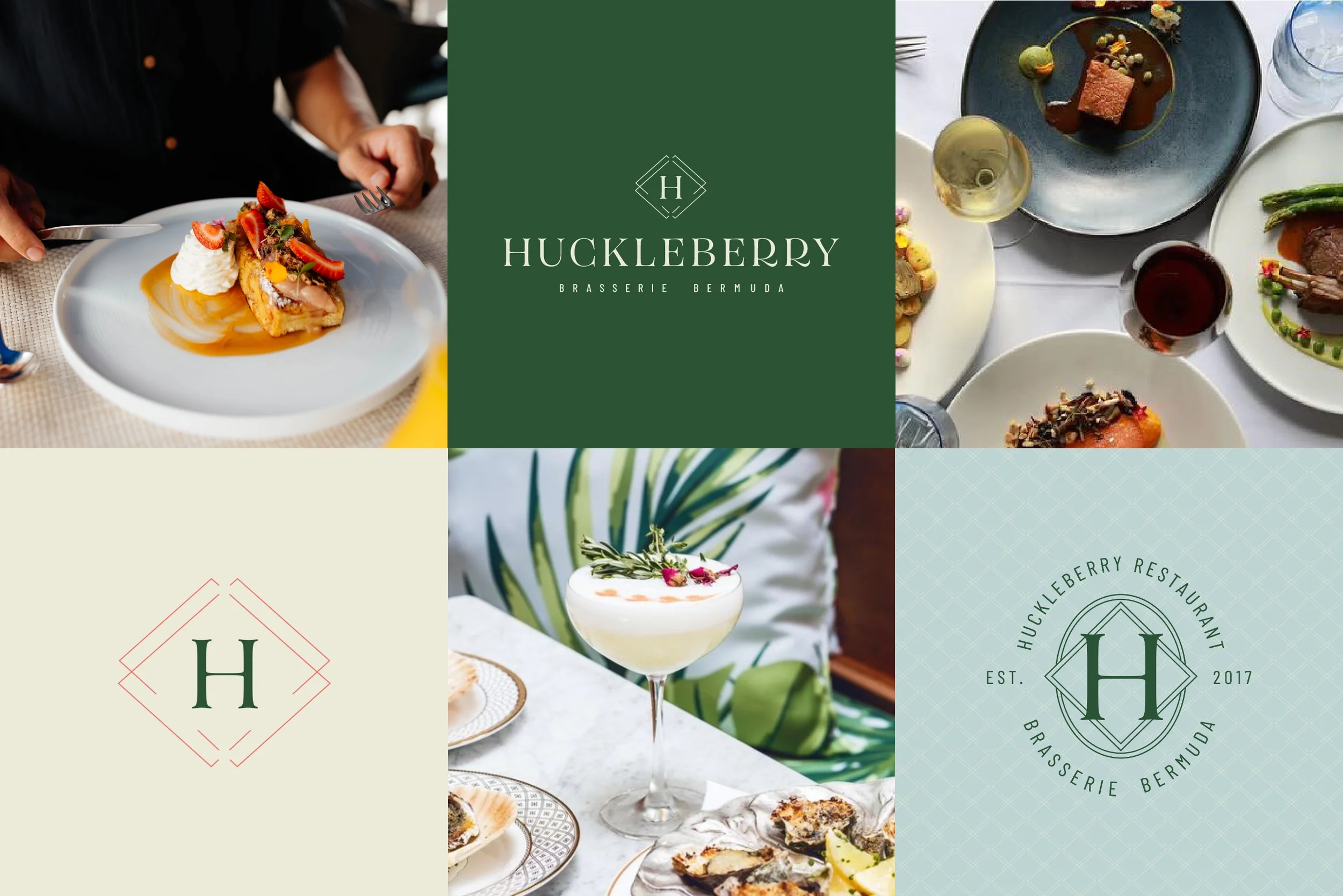
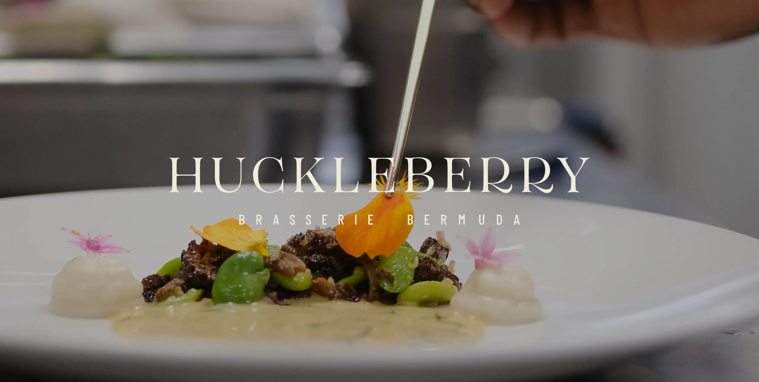
With the core brand established, we helped transform Rosedon into a true lifestyle destination through a series of new food and beverage concepts, starting with Huckleberry.
It was clear the original fine-dining approach needed to evolve - better aligned with Rosedon’s new, design-led vibe and more suited to everyday dining, from breakfast through to dinner
More projects
-
![]()
Poolside Bar | Brand Development
-
![]()
Bagels & Brews | Brand Creation
-
![]()
Clarabell's Restaurant | Collateral Design
-
![]()
Rosedon Hotel | Brand Refresh